This week’s blog is by up-and-coming theatre projection designer Robert Mallin who shares his experience working on the award-winning video design and realization of “ENRON” at the University of Texas at Austin. Find out how he tackled the creative and practical aspects of the design which featured eight overhead screens, two projectors and a barrage of information.
- The production
- The design
- The tech solution
- The result
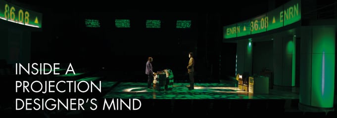
THE PRODUCTION
ENRON the play is a modern satire written by Lucy Prebble about the infamous Houston-based company by the same name. Prebble’s ENRON masterfully navigates between entertainment and actual facts - making what would otherwise be a financial lecture into an emotional rollercoaster of spectacle! In order to successfully blend the facts into theatrical entertainment, Prebble uses metaphors, musical numbers, satirical characters, fast pacing, and in particular interest of this article - video. Prebble calls on video in her script when she wants to show actual interviews, Enron commercials, or set a time period through montages that use iconic moments in history.
Our production of ENRON, directed by Hannah Wolf, used a cast of all female and non-binary actors. In an interview with Wolf she states “seeing the ensemble in these powerful roles who do not have the genetic qualities of "the powerful" means we can assess what we assume success looks like.” The performance opened on February 21, 2018 in the Oscar Brockett Theatre at the University of Texas at Austin – a few short hours from Houston itself. Jeffrey Skilling, former CEO of Enron, is scheduled to be released from prison, February 21, 2019.
THE design
SCREEN DESIGN
Our production used an alley-’ish’ stage configuration. The set was inspired by the Enron building (now owned by Chevron) and was designed by Roxy Mojica. The set stretched end-to-end in the theatre and featured two curved balconies with frosted glass railings - one on either end of the space. Adding to Mojica’s design with my own design inspirations of stock tickers and television arrays, I proposed we extend the gesture of the balconies by connecting them across the space with our own aerial array of televisions. I further proposed that I would project video into the curved balconies – effectively creating a 360 degree ‘halo’ of video surfaces above the stage.

CONTENT DESIGN
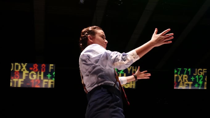
The screen design for this show meant that the televisions would be ever present in the scenes and therefore whenever they were not delivering content they would pull focus and make the scene feel incomplete. In general, I have found this to be true in most video designs, therefore I often seek a ‘neutral state’ that fits a scene - other than video black. As an example in ENRON, there is a scene early in the play that did not need the use of the televisions. Rather than sitting in video black, I created a gradient still image that matched a lighting look created by lighting designer Aaron Curry. Another example would be for scenes that take place in the basement of Enron, known as LJM, where all the clever accounting took place. Inside LJM there are physical raptor puppets roaming the space, designed by Caitlin Graham, and taking inspiration from her, I designed complementary content that was digital, green, and mathematically chaotic!
A storytelling device in ENRON is to have actors delivering the news about the company as television reporters. I suggested to the team that instead of these reports being live on stage, we could further blend the world of fact and fiction by creating a fake news broadcast that would play on cue through our televisions. This presented an exciting challenge in playback because it meant video was now an actual character in the show – and needed to hit lines in time with actors who were reacting to it.
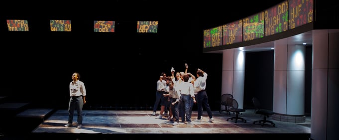
The moments where Prebble calls on video montages directly became an exciting exploration. For this particular element, sound designer Malyssa Quiles let me cut my own audio that would meet her approval. The reason for this was that I could coordinate four video montages (one per screen on either side of the space) along with each clip's audio. As an example, there is a montage called for in the script which shows “happy moments” from the nineties. For this montage I cut four separate montages to the soundtrack of “MMMBop” by the Hanson Brothers. The videos featured sports championships, famous musicians, historical moments, and memorable commercials.
Each video was played on one of the four screens, and mirrored on the opposite side of the stage. What was unique to this, was that audio from some of the clips in some of the videos would play overtop of the “MMMBop” soundtrack. This created a sensory overload by barraging the audience with four screens of quickly changing content; audio shifting the focus from one screen to another; and ultimately provided the audience with a nostalgia of the nineties.
THE TECHNICAL SOLUTION
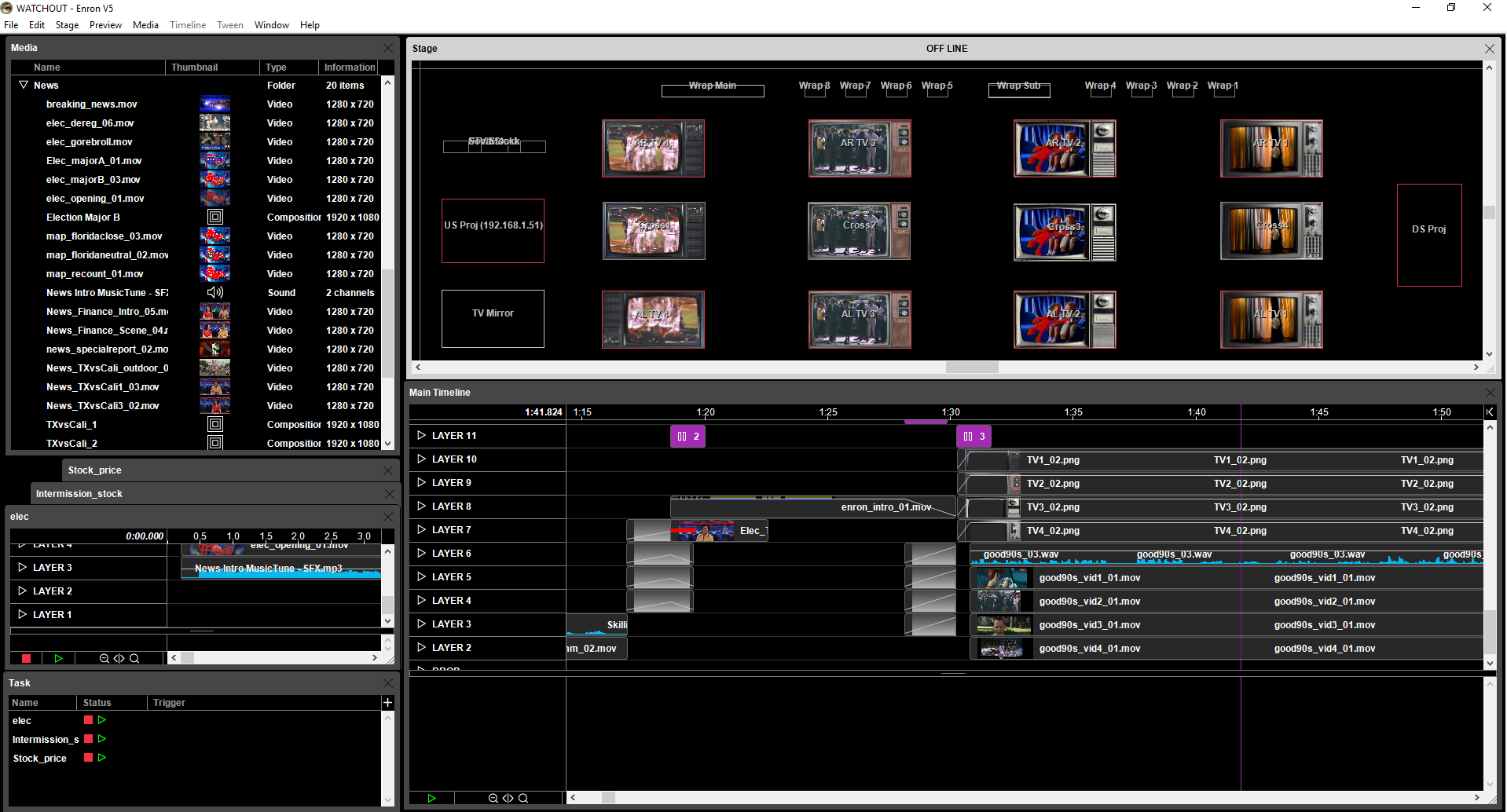
The script, and our own ideas, called for a highly flexible and particular arrangement of video surfaces - not to mention a need to support ten separate outputs plus a GUI. Given past experiences and our productions needs, I decided that our tool of choice should be WATCHOUT.
The video moments in the show required that all ten surfaces be (or appear to be) a single surface – allowing content to wrap around the entire space. It also required the ability to mirror four videos to the televisions opposite each other, and mirror one video to all eight televisions. We also needed to layer these surfaces so that content could blend appropriately. We decided to use audio playback in WATCHOUT to ensure moments that required audio and video to be synchronized, where consistent.
To do this I had five WATCHOUT display servers above the stage, each feeding two outputs, and an instance of WATCHOUT production running on a laptop. I prepared my stage window by creating displays for each output. I had a challenge in mapping the projectors on a downward angle into a curved surface - while having the content appear to acknowledge the curve of the balconies.
Once all surfaces where working and focused, I created a myriad of virtual displays to achieve all the needs of the show. First, and most simple, I created a single virtual surface that displayed its content into each of the eight televisions – effectively creating a 1x8 mirror. This would allow me to place one piece of content and have it replicate across all surfaces, likewise a single adjustment to say, color, would repeat across all surfaces. I did the same process to create mirrors across the space between opposite televisions, creating a 1x2 mirror four times.
Next, our show required the Enron stock price be visible on either balcony as it would go up or down. In some cases, we only wanted to see it on the balconies or sometimes we wanted to see it over all ten surfaces. To avoid re-creating content for each surface, and programming them all to work in time with each other, I prepared a single piece of content and used virtual displays to ‘cut up’ the content as needed for each display. This way, a single piece of content and cue, would cause all surfaces to function as needed – saving me massive amounts of time in rendering and content creation.
 Finally, I needed to combine the televisions together with the projectors, to create an entire surface for our stock ticker moments. To do this, I estimated that each panel of glass in the balcony was approximately equal to the size of a single television. Then I simply worked out the resulting math for each glass panel's resolution and used that to generate a row of virtual surfaces with the results. I accounted for the empty space between each video surface by spreading the surfaces apart from each other by the same ratio of physical space to pixels. Once this was established, I generated content that fit the resulting resolution of 11520x220, and could loop on itself.
(Below is a screenshot from the programming of the montage sequences.)
THE RESULT
In summary, realizing this production's video design was a blast! The audience and critics seemed to agree…
“Robert Mallin's projection designs are marvelous, setting time and place perfectly. While the projections feature a barrage of information for the audience to absorb, operating on around twenty overhead screens, Mallin even often has competing information going on and yet manages to still ensure that the audience gets the most important information out of the sensory overload that is presented. The visual work here clearly functions as a character, [and] does so brilliantly.” Broadway World
“Robert Mallin and sound designer Malyssa Quiles, will put you squarely back in the Nineties with the music and TV footage that some of us know only too well.” Austin Chronicle
"ENRON" is the winner of the 2018 Austin Critics Table Award for Best Digital Design.
“ENRON” has multiple nominations at the 2018 B. Iden Payne Awards, including Outstanding Media Design. Winners to be announced November 5, 2018.